
It’s that time of the week again, friends! We’re back with another Top Ten Tuesday, a weekly meme hosted by That Artsy Reader Girl. This week’s prompt is: cover redesigns I’ve loved/hated. Okay, I admittedly struggled with this one because I realized that I’m actually not very aware of what book covers have been redesigned. Are different editions of books considered cover re-designs? Like, international vs US vs UK editions? I’m still not very clear on it but I’ve made a list of some covers that I’ve loved and hated. I think most of the time when a cover changes I’m pretty okay with it, although sometimes, I’m disappointed that the original covers get pulled and we mere mortals won’t ever have the chance to get our hands on it without kissing our monies goodbye! *drama*


Shadow and Bone (The Shadow and Bone Trilogy #1) by Leigh Bardugo
I know that a lot of people have commented that they like the original cover so much more, but I actually really like the redesigned cover more. I think this is mostly because of the colors!


Throne of Glass (Throne of Glass #1) by Sarah J. Maas
I like the cover redesign so much better than the original cover. It’s just honestly so much more bad ass and fitting of the fierce killer character that Celaena is introduced as!


Northern Lights (His Dark Materials #1) by Philip Pullman
This one also has a different name: The Golden Compass but I prefer The Northern Lights name and cover much more. There are so many versions of both titles but I think these are my two favorites!


Vicious (Villains #1) by V.E. Schwab
One of my biggest book related regrets is not buying that original/first edition cover of Vicious before the series became popular. I don’t know why I didn’t do it, but I was a silly duck. I do love the editions that I have now, but the details in the first edition are awesome and if I were to buy one now, I’d have to sell an arm, leg and liver for it (probz, you know) 😅
★★★★☆ 
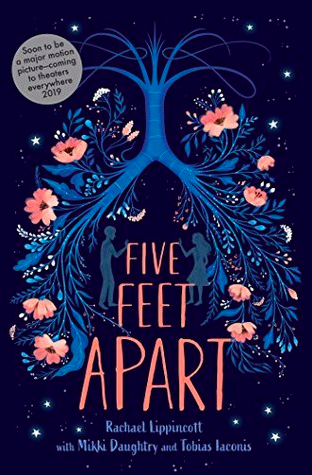
Five Feet Apart by Rachael Lippincott
This probably doesn’t count but I’m making it count because I’ve only been able to find the movie cover locally and I don’t know why they’d ever change it. That first cover is gorgeous!


Daughter of Smoke and Bone (Daughter of Smoke and Bone #1) by Laini Taylor
I don’t know what to say about that cover with the mask except I really hate it. I also hate that it was actually the redesign? Or is it just the the US edition? Whichever it is, I’m really not here for it lol


The Girl He Used to Know by Tracey Garvis Graves
While I don’t dislike the cover with all the hearts on it, the colors are beautiful and stand out, but I like the simple cover with the girl on the front so much more.


The Handmaid’s Tale (The Handmaid’s Tale #1) by Margaret Atwood
I actually do love the original cover, but I don’t hate the cover of the modern vintage edition.


An Ember in the Ashes (An Ember in the Ashes #1) by Sabaa Tahir
I actually don’t mind both covers although I do love the redesign because I love seeing the characters’ on the front and I love seeing how they change through the rest of the book covers!


Harry Potter and the Sorcerer’s Stone (Harry Potter #1) by J.K. Rowling
Obviously depending on where you’re from and what edition you’re reading, it’s also The Philosopher’s Stone! The HP books have gone through so many cover redesigns/editions but the ones I will always love most are the first (US) ones. It takes me back to my childhood and I’m not so much a fan of the newer editions (sorry not sorry)!

Do you like cover redesigns or different cover editions? Are any of the ones you’ve liked/hated on this list too? If you’ve also done a TTT for today, don’t forget to leave your links in the comment and let’s chat 🙂

Oh my god I’m creasing with laughter 😂😂😂 this post is hilarious. I also don’t like that smoke and bone mask cover… Wonder why I bought the box set of it then… 🤔🤔🤔 lol I make no sense!!! The five feet apart floral cover is gorgeous and is not at all the reason why I bought it………. 🙈😂😂😂 Fab TTT!!! ❤
LikeLike
There are so many cover resdesigns of Harry Potter that I love! I forgot to add them to my list!
LikeLike
there are sooo many harry potter designs lmao and yeah i’m so partial to the originals. I love this post you’re so funny
LikeLike
I think your picks are spot on with Vicious (so cool) and Northern Lights. I own the modern edition of The Handmaid’s Tale and really prefer the minimalism.
LikeLike
I prefer the older cover of The Handmaid’s Tale, too, but the new one does have its perks. For example, is the handmaid in it pregnant?!
My TTT.
LikeLike
I’m one of the ones who like the original Shadow and Bone cover. Something about the black, gray, and red color combination just really appeals to me. the Throne of Glass remake definitely is so much nicer! I love the Ember in the Ashes redesign, too, for all the reasons you mentioned. 🙂
LikeLike
Wait a minute. I thought that blue cover DoSaB was the original cover? Because that was there when I initially read the ebook. Well, whatever the case, I agree with you on all the covers. I wasn’t even aware that the left cover of Shadow and Bone existed until now. And I definitely like that one more. Love the color and the gritty vibe to it!
LikeLike
I always cringe when I see the original Throne of Glass cover. It is just So. Bad. I mean, when I think of badass Celaena, the soft girl on the cover is NOT what comes to mind. LOL I so agree with the cover for The Girl I Used to Know. The hearts aren’t bad, I guess, but the other cover seems to fit so much better.
LikeLike
I’m really not keen on the Daughter of Smoke and Bone mask cover either! In complete agreement with Northern Lights, too. The new edition is so pretty. Great list! 🙂
LikeLiked by 1 person
Thank you! I really don’t like the DoSaB cover but unfortunately it seems to be the only one I can find anywhere! Lol
LikeLiked by 1 person
So I think different country editions technically *don’t* count as redesigns, but there isn’t really a rule! Choose what you want.
LikeLike
The new Shadow & Bone covers grew on me as well! At first I didn’t like them, but I’ve come to appreciate them so much! I also adore the original cover for Five Feet Apart (hello cover buy) although I will say that the movie cover tie in is actually one of my favorites that I’ve ever seen. It just doesn’t live up to the original when you compare the two!
LikeLiked by 1 person
I have to say that for a movie cover the one for Five Feet Apart isn’t bad. But I just love the playfulness of the original cover, plus it reminds me of the types of drawings that Stella’s sister made! Lol
LikeLiked by 1 person
The Throne of Glass redesign is so much better, I agree. She looks way more badass there! I like the newer Handmaid’s as well, and both of those Bardugo versions are pretty good. 🙂
LikeLike
I actually love the new Handmaid’s Tale cover! I bought that edition specifically because of it!
LikeLike
Wow! I lot of us chose Throne of Glass and a lot of those who comment agree. That one really seemed to have struck a chord.
LikeLike
I had several of the same ones on my list. I agree with you on the cover for The Girl He Used to Know. The hearts aren’t bad, but I really love everything about the one with the girl on it. It reminds me of a painting.
LikeLike
I also like the redesigns of An Ember in the Ashes. I do love seeing more representation on book covers. Also, so happy they redesigned the TOG series. That first cover was just a no.
LikeLike
I agree 100% with The Handmaid’s Tale and Harry Potter!
LikeLiked by 1 person
For Grisha, I like both! For ToG, I much prefer the redesign! For An Ember, I prefer the OG cover much much more, especially the US cover. And Laini’s series needed that cover redesign, in my opinion. I agree that Five Feet Apart’s OG cover is gorgeous!
Genesis @ Whispering Chapters
LikeLiked by 1 person
I don’t mind the OG Ember covers but I do like seeing their faces and details of their characters (like the steel masks)! Laini’s definitely needed the cover redesign and for ALL of them not just the first in the series lol
LikeLike
I do love that redesign of Throne of Glass best!
LikeLiked by 1 person
I positively adore the redesigns for the Grisha trilogy but I also adore the older editions too so I’m over here swooning over both designs in different ways. I feel you 100%. I think I lean towards the newer ones, too, because of the colours. I swear I’m not drooling.
LikeLiked by 1 person
Haha I wouldn’t even blame you if you were staring and drooling because they’re truly beautiful! 😉
LikeLike
I agree with you about Throne of Glass, the redesign is definitely more fitting!
LikeLiked by 1 person
Sadly, haven’t read any of those except for HP but I the US ones are also the first ones I saw and those are what I’m attached to more 🙂
LikeLiked by 1 person
Same! Just looking at the covers gives me (vague) flashbacks to when I first got them and where I was! Lol I remember the excitement though 😊
LikeLiked by 1 person
I do like the new Shadow and Bone cover, but I still love the originals. 🙂
LikeLiked by 1 person
Fair enough! I just love bright colors and shiny things so that always pulls me 😂
LikeLike
I love the redesigns for Shadow and Bone too!
LikeLiked by 1 person